Optimizing HTML for PDF: Print CSS, @page & Page Breaks


PDF documents preserve formatting across devices, but converting HTML to PDF often produces broken layouts, misplaced page breaks, and missing fonts. This guide covers the CSS print rules, page break controls, and HTML structure patterns that fix those problems.
Why HTML to PDF Conversion Can Be Challenging
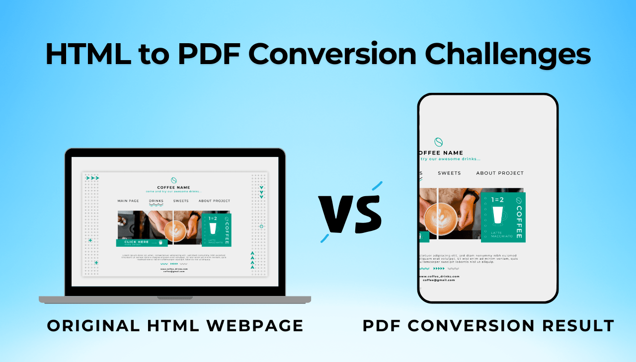
When you convert HTML to PDF, you are translating dynamic, responsive designs into fixed-layout documents. This introduces several challenges:
- Rendering Inconsistencies: Different PDF engines interpret HTML and CSS differently than browsers.
- Page Breaks: Web content flows continuously, while PDFs require discrete pagination.
- Font Rendering: Font inconsistencies between web and print environments.
- Fixed vs. Responsive Layout: Transitioning from fluid layouts to fixed dimensions.
- Resource Management: Handling images, scripts, and styles during conversion.
Understanding these challenges helps you structure your HTML documents for clean conversion from the start.
Start with the end in mind. When planning a document that will ultimately become a PDF, consider the fixed-layout nature of the final output from the beginning of your design process.
For a broader comparison of PDF generation approaches, see How to Generate PDFs in 2025.
Understanding PDF Rendering Engines
The rendering engine determines how your CSS and HTML get interpreted. Most HTML to PDF converters fall into three categories:
Browser-Based Engines
These solutions (like Puppeteer, Playwright, or headless Chrome) use browser rendering engines to generate PDFs:
- Advantages: Full CSS support, JavaScript execution, modern web feature compatibility.
- Disadvantages: Memory-intensive, potentially slower for large documents, may require server resources.
Dedicated PDF Libraries
Specialized libraries like WeasyPrint, PDFKit, wkhtmltopdf, and many others are purpose-built for HTML to PDF conversion, with options available for most programming languages:
- Advantages: Often faster processing, lower resource usage, better control over PDF-specific features.
- Disadvantages: May have limited support for advanced CSS or JavaScript.
Cloud-Based PDF Services
API-driven solutions (like PDFBolt, DocRaptor, or similar services) handle PDF conversion through cloud infrastructure:
- Advantages: No server setup or maintenance, consistent rendering across environments, automatic updates, scalable infrastructure, often combine benefits of both browser-based and dedicated engines.
- Disadvantages: Requires internet connectivity, ongoing service costs.
Knowing which engine your converter uses helps you pick the right CSS approach. Browser-based engines and PDF generation APIs support complex CSS, while dedicated libraries may need simpler styling.
Choosing the Right Solution for Your Needs
When selecting a conversion engine, consider these factors:
- Document complexity: How sophisticated is your HTML/CSS.
- JavaScript requirements: Does your content rely on dynamic JavaScript execution.
- Performance needs: What are your speed and resource requirements.
- Scale: Are you generating one-off documents or thousands in batch.
Test your document with multiple rendering engines before committing to a specific conversion approach. Different engines can produce very different results with the same HTML input.
HTML Structure Best Practices
Good PDF conversion starts with well-structured HTML.
Use Semantic HTML
Semantic elements provide structure that PDF converters can interpret more effectively:
❌ Poor structure:
<!-- Generic divs provide no structural meaning to PDF converters -->
<div class="title">Report Title</div>
<div class="subtitle">Quarterly Results</div>
✅ Better structure:
<!-- Semantic header element clearly defines document structure -->
<header>
  <h1>Report Title</h1>
  <h2>Quarterly Results</h2>
</header>
Implement Proper Nesting
A logical document hierarchy with properly nested elements helps PDF engines interpret the document structure correctly.
How to Properly Nest Elements
<!-- Uses semantic article instead of generic div -->
<article>
  <!-- Uses semantic header element -->
  <header>
    <h1>Annual Financial Report</h1>
    <p class="date">January 2025</p>
  </header>

  <!-- Uses proper semantic sections instead of ungrouped content -->
  <section id="executive-summary">
    <!-- Follows correct heading hierarchy (h1 → h2) -->
    <h2>Executive Summary</h2>
    <p>Financial highlights from the past year...</p>

    <!-- Properly nests related content in a semantic section -->
    <section id="key-metrics">
      <!-- Maintains logical heading progression (h2 → h3) -->
      <h3>Key Performance Metrics</h3>
      <ul>
        <li>Revenue growth: 12%</li>
        <li>Profit margin: 8.5%</li>
      </ul>
    </section>
  </section>

  <!-- Consistent use of section elements instead of mixing section and div -->
  <section id="financial-statements">
    <h2>Financial Statements</h2>
    <!-- More content -->
  </section>
</article>
Common Nesting Mistakes to Avoid
<div class="report">
  <!-- Missing header grouping -->
  <h1>Annual Financial Report</h1>
  <p class="date">January 2025</p>

  <!-- Improper heading hierarchy -->
  <h3>Executive Summary</h3> <!-- Should be h2 -->
  <p>Financial highlights from the past year...</p>

  <!-- Ungrouped related content -->
  <h4>Key Performance Metrics</h4>
  <ul>
    <li>Revenue growth: 12%</li>
    <li>Profit margin: 8.5%</li>
  </ul>

  <!-- Inconsistent section structure -->
  <div class="statements">
    <h2>Financial Statements</h2>
    <!-- More content -->
  </div>
</div>
- Structure: Use
<article>as container, with<section>elements for each major part. - Hierarchy: Implement proper heading hierarchy:
h1→h2→h3etc. - Group related fields and elements.
Control Page Breaks
Without proper page break control, content splits awkwardly across pages – headings appear at the bottom with no following text, tables break mid-row, and images get cut in half.
How to Control Page Breaks Effectively
Avoid breaking inside important elements:
h2, h3, table, .important-box {
  page-break-inside: avoid;
}
Force breaks after major sections:
section, .chapter-end {
  page-break-after: always;
}
Prevent orphaned headings:
h2, h3 {
  page-break-after: avoid;
}
Keep minimum lines together (avoid orphans/widows):
p {
  orphans: 3; /* Minimum lines at bottom of page */
  widows: 3;  /* Minimum lines at top of page */
}
Visual Comparison of Page Break Control
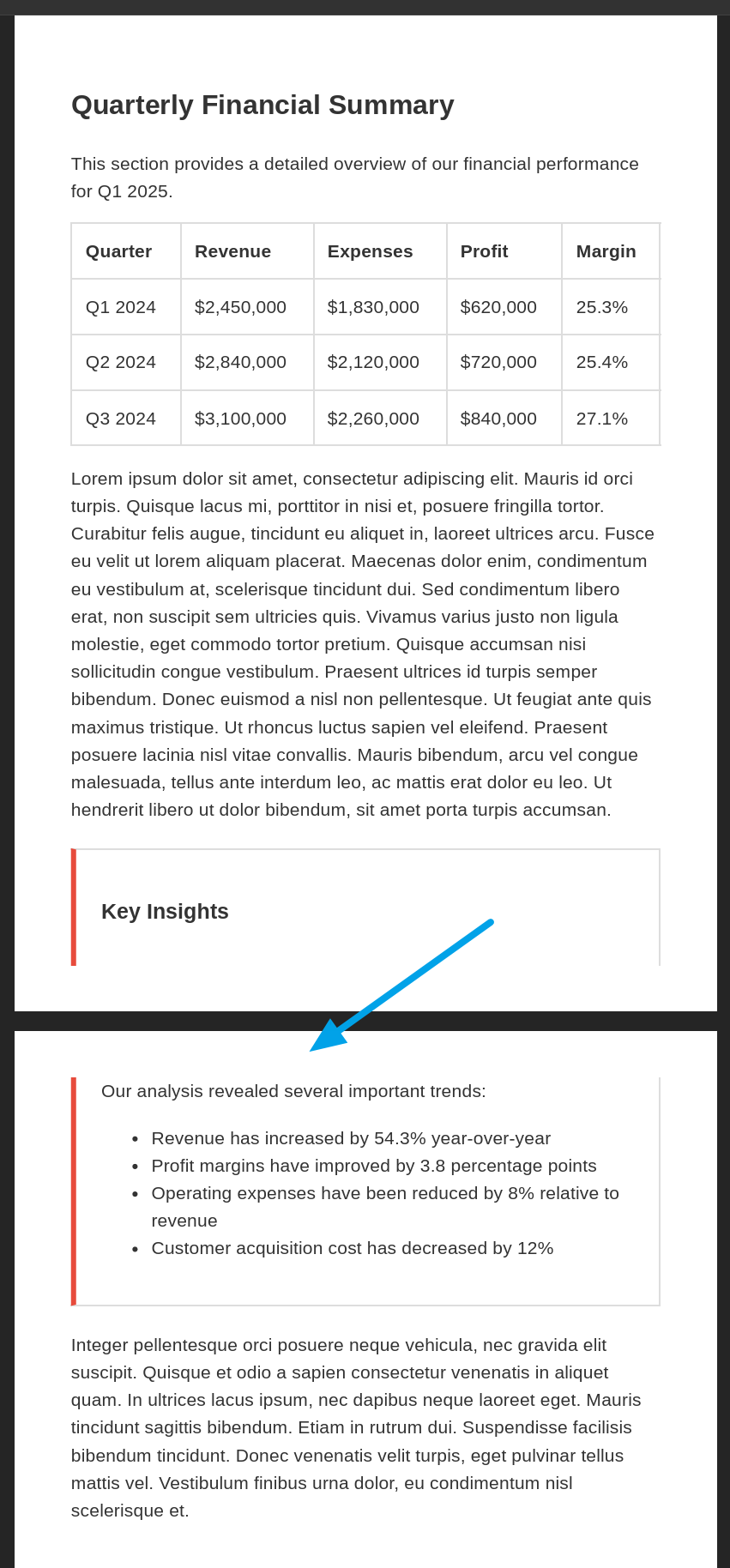
Without:
page-break-inside: avoid;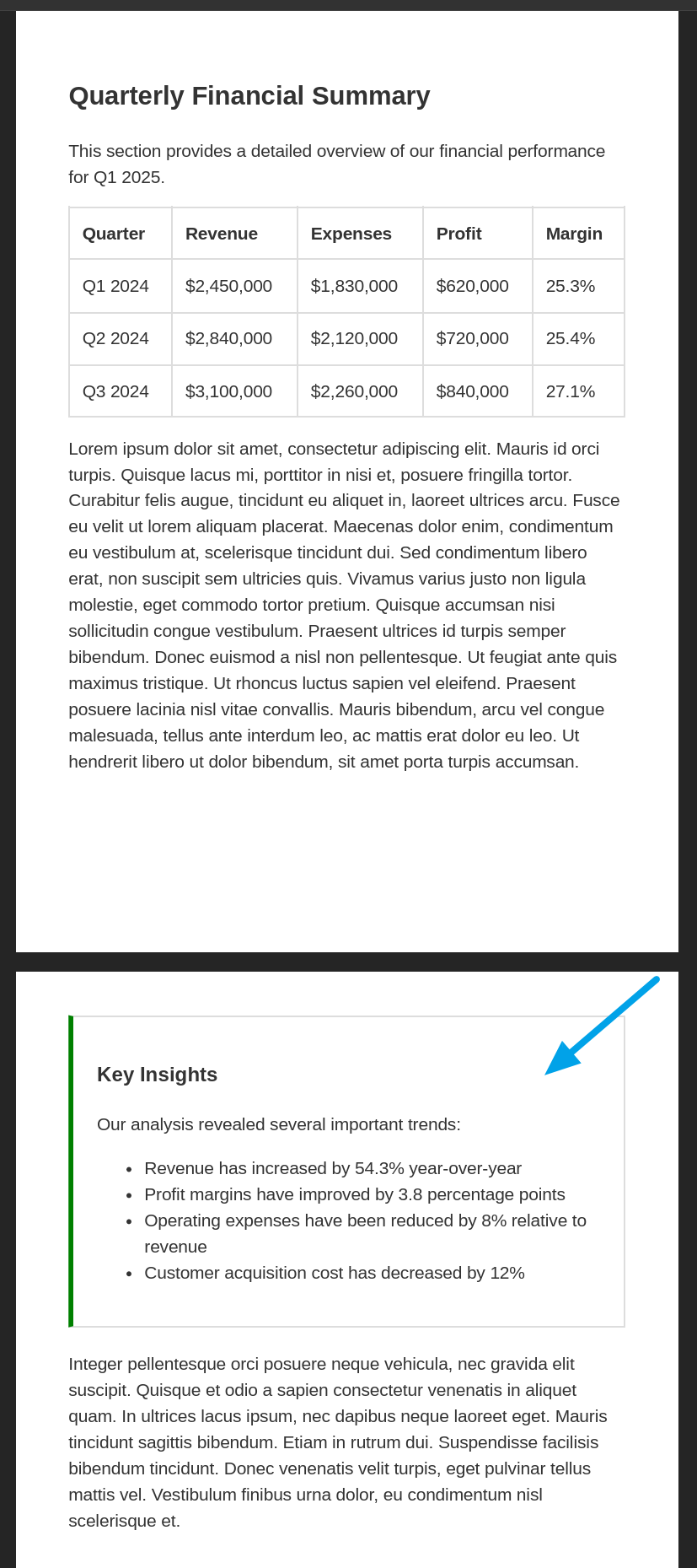
Using:
page-break-inside: avoid;Page Break Control for Specific Elements
Tables
Keep header with first few rows:
thead {
  display: table-header-group;
}
Allow row groups to break across pages:
tbody {
  page-break-inside: auto;
}
Keep individual rows together:
tr {
  page-break-inside: avoid;
}
Preventing Table Row Splitting
Without
page-break-inside: avoid; on tr elements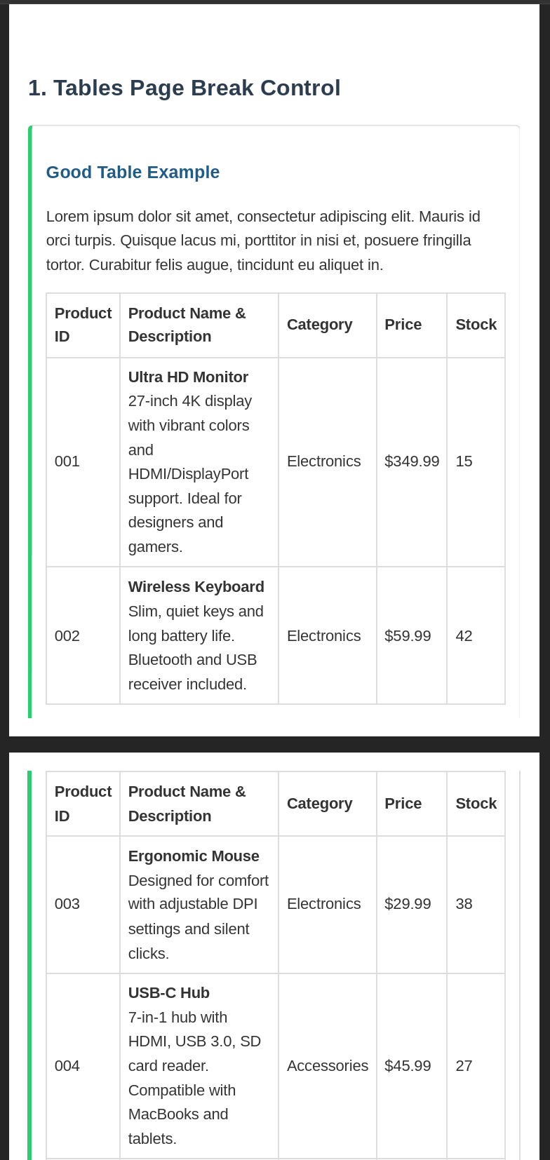
Using
page-break-inside: avoid; on tr elementsImages and Captions
Keep figure and its caption together:
figure {
  page-break-inside: avoid;
}
Lists and Related Items
Keep list intro with first few items:
.list-container {
  page-break-inside: avoid;
}
Allow very long lists to break:
.long-list {
  page-break-inside: auto;
}
Keep list items together:
li {
  page-break-inside: avoid;
}
Common Page Break Mistakes to Avoid
/* Too aggressive - may cause large empty spaces */
.content-box {
  page-break-inside: avoid; /* Problematic if box is very large */
}

/* Breaking all sections - wastes paper */
section {
  page-break-before: always; /* Forces break before every section */
}

/* Creates potential empty pages */
h2 {
  page-break-after: always;
  page-break-before: always;
}
- Avoid breaks: Use
page-break-inside: avoidon elements that should stay together. - Force breaks: Apply
page-break-after: alwaysat logical document divisions. - Prevent orphaned headings: Set
page-break-after: avoidon headings. - Control text flow: Use
orphansandwidowsproperties to prevent single lines.
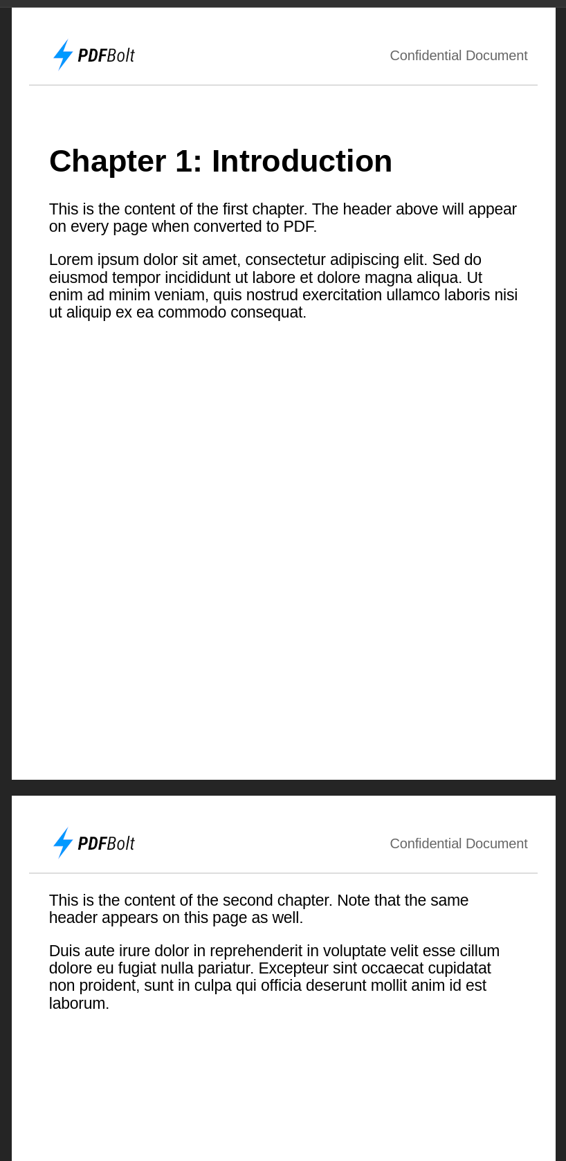
PDF Headers and Footers Implementation
Headers and footers add page numbers, document titles, and branding to each page of a PDF. There are three main ways to implement them, depending on your conversion tool.
Approach 1: Fixed Positioning Method (Basic Implementation)
This approach is simple but has limitations – the fixed-position header may overlap content or not repeat on every page, depending on the converter.
CSS for header with fixed positioning:
.page-header {
    position: fixed;
    top: 0;
    left: 0;
    right: 0;
    height: 60px;
    background-color: white;
    border-bottom: 1px solid #ddd;
}

.content {
    margin-top: 80px; /* Space for header */
}
HTML structure:
<body>
    <div class="page-header">
        <img src="logo.png" alt="Company Logo">
        <p>Confidential Report</p>
    </div>

    <!-- Main content would go here -->
    <div class="content">
        <!-- Document content -->
    </div>
</body>
View example output
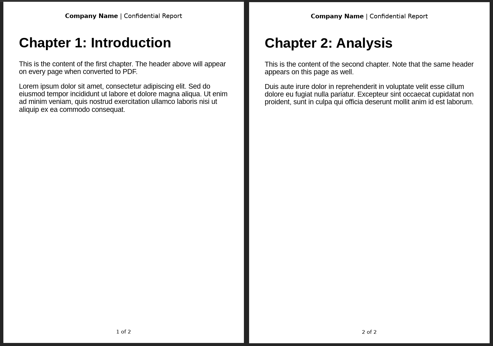
Approach 2: CSS Paged Media (Professional Implementation)
The CSS Paged Media specification lets you create true document headers and footers with control over positioning, page numbering, and styling.
CSS for header and footer with Paged Media:
@page {
    size: A5;
    margin: 2cm;

    /* Header areas */
    @top-left {
        content: element(headerLeft);
        border-bottom: 1px solid #ddd;
    }
    @top-center {
        border-bottom: 1px solid #ddd;
    }

    @top-right {
        content: element(headerRight);
        border-bottom: 1px solid #ddd;
    }

    /* Footer with page numbers */
    @bottom-center {
        content: counter(page) " / " counter(pages);
        font-size: 10pt;
    }
}

/* Define running elements */
.headerLeft {
    position: running(headerLeft);
}

.headerRight {
    position: running(headerRight);
    font-size: 10pt;
    text-align: right;
    color: #666;
}
HTML structure:
<body>
    <!-- Running header elements must be defined first -->
    <div class="headerLeft">
        <img src="logo.png" alt="Company Logo for PDF header">
    </div>

    <div class="headerRight">
        Confidential Document
    </div>

    <!-- Main content would go here -->
    <h1>Chapter 1: Introduction</h1>
    <!-- Document content -->
</body>
This solution works best with specialized PDF converters like Prince and PDFreactor that fully support the CSS Paged Media specification. Check your conversion tool's documentation for compatibility.
Approach 3: Browser-Based API Implementation
Browser-based PDF tools like Playwright and Puppeteer have built-in header and footer options in their APIs.
Playwright example:
// PDF generation with Playwright
await page.pdf({
    path: 'document.pdf',
    format: 'A5',
    displayHeaderFooter: true,
    headerTemplate: '<div style="font-size:10px;width:100%;text-align:center;padding:5px;"><strong>Company Name</strong> Confidential Report</div>',
    footerTemplate: '<div style="font-size:10px;width:100%;text-align:center;padding:5px;">Page <span class="pageNumber"></span> of <span class="totalPages"></span></div>',
    margin: { top: '1.5cm', bottom: '1.5cm' }
});
HTML structure (simplified, actual headers/footers handled by tool):
<!-- No special HTML needed for headers/footers -->
<div class="content">
    <!-- Document content -->
</div>
View example output:
Document Structure Do's and Don'ts
A well-structured HTML document renders more consistently across PDF converters and is easier to maintain.
| Do ✅ | Don't ❌ |
|---|---|
Use semantic elements: <article>, <section>. | Rely on generic divs with classes. |
Create a logical heading hierarchy: h1 → h2 → h3. | Skip heading levels or use headings for styling. |
| Keep related content in appropriate containers. | Scatter related content across the document. |
| Structure with pagination in mind. | Ignore page breaks in fixed-layout documents. |
| Test with PDF accessibility tools. | Neglect PDF-specific accessibility requirements. |
CSS Optimization for PDF Output
Standard web CSS focuses on responsive layouts and screen rendering. PDF-focused CSS needs a different approach – fixed dimensions, absolute units, and explicit page break controls replace the fluid layout patterns you use on the web.
Use Print-Specific Styling
Always separate your screen and print styles using media queries to create documents that perform well in both environments.
Standard styles for screen display:
body {
  font-size: 16px;
  line-height: 1.5;
  background-color: #f5f5f5;
  color: #333;
}
Override styles for PDF output:
@media print {
  body {
    font-size: 12pt; /* Print-specific font size */
    line-height: 1.2; /* Tighter line height for print */
    background-color: white; /* Use white background */
    color: black; /* Ensure good contrast for printing */
    width: 100%; /* Reset any width constraints */
  }

  /* Hide web-only elements */
  nav, .sidebar, .web-only, .social-buttons {
    display: none;
  }
Screen vs. Print Views
Choose Appropriate Units
For PDF documents, absolute units produce more consistent results across different converters than relative units.
❌ Problematic for print:
.document-section {
  width: 80%; /* Relative to what? Container varies in PDFs */
  margin: 2em; /* Based on font-size, which may change */
  font-size: 1.2rem; /* Will vary by user settings */
  padding: 5vh 3vw; /* Based on viewport which doesn't exist in PDFs */
}
✅ Optimal for print - precise sizing:
.document-section {
  width: 7in; /* Absolute width */
  margin: 0.5in; /* Consistent margins */
  font-size: 12pt; /* Standard print typography size */
  padding: 12pt 18pt; /* Consistent padding */
}
Print Unit Recommendations
| Unit | Usage | Best for | Examples |
|---|---|---|---|
pt (points) | Typography, small measurements | Text, line thickness | font-size: 12pt; border: 1pt solid; |
in (inches) | Page layout, US documents | Margins, widths | margin: 0.5in; width: 8in; |
cm (centimeters) | Page layout, international | Margins, content blocks | margin: 2cm; width: 15cm; |
mm (millimeters) | Precise measurements | Fine spacing, thin elements | padding: 5mm; border-radius: 2mm; |
Never rely on viewport-based units: vw/vh or percentage-based sizing for critical layout elements in PDF documents. These units behave unpredictably across different PDF converters.
Manage Font Embedding
Font consistency is one of the most common challenges in HTML to PDF conversion. Different PDF converters handle fonts differently, and without proper font embedding, your carefully chosen typography may default to basic system fonts.
To get consistent font rendering:
- Using web-safe fonts or embedding custom fonts.
- Specifying complete font stacks with fallbacks.
- Using web fonts with proper @font-face declarations.
Complete @font-face declaration for reliable font embedding:
@font-face {
  font-family: 'Merriweather';
  src: url('fonts/Merriweather-Regular.woff2') format('woff2'),
       url('fonts/Merriweather-Regular.woff') format('woff'),
       url('fonts/Merriweather-Regular.ttf') format('truetype');
  font-weight: normal;
  font-style: normal;
  font-display: swap;
}

@font-face {
  font-family: 'Merriweather';
  src: url('fonts/Merriweather-Bold.woff2') format('woff2'),
       url('fonts/Merriweather-Bold.woff') format('woff'),
       url('fonts/Merriweather-Bold.ttf') format('truetype');
  font-weight: bold;
  font-style: normal;
  font-display: swap;
}
Full font stack with web-safe fallbacks:
body {
  font-family: 'Merriweather', Georgia, 'Times New Roman', Times, serif;
}

h1, h2, h3, h4, h5, h6 {
  font-family: 'Open Sans', Helvetica, Arial, sans-serif;
  font-weight: 600;
}
Ensure consistent font sizing:
@media print {
  body {
    font-size: 11pt;
  }
  h1 { font-size: 22pt; }
  h2 { font-size: 18pt; }
  h3 { font-size: 15pt; }
  p, li { font-size: 11pt; }
  figcaption, footer { font-size: 9pt; }
}
- Licensing: Check font licensing restrictions, as many commercial fonts prohibit embedding in distributed PDFs without proper licensing.
- Tool-specific settings: Check your PDF converter's documentation, as different engines may require specific configuration for proper font embedding.
Control Page Dimensions and Margins
The @page rule controls page size and margins in the generated PDF.
Basic page setup:
@page {
  size: A4; /* Standard ISO A4 size */
  margin: 2cm; /* Uniform margins */
}
Advanced page setup with different margin sides:
@page {
  size: letter; /* US Letter size (8.5" × 11") */
  margin-top: 3cm;
  margin-right: 2cm;
  margin-bottom: 2.5cm;
  margin-left: 2.5cm;
}
Different settings for first page:
@page :first {
  margin-top: 6cm; /* Larger top margin for title page */
}
Different settings for left/right pages (like in books - more space near the spine):
@page :left {
  margin-left: 2.5cm;
  margin-right: 2cm;
}

@page :right {
  margin-left: 2cm;
  margin-right: 2.5cm;
}
Common Page Size Reference
| Name | Dimensions | Usage |
|---|---|---|
| A4 | 210 × 297 mm | Standard international business documents. |
| Letter | 8.5 × 11 inches | Standard US business documents. |
| Legal | 8.5 × 14 inches | Legal documents in US. |
| A5 | 148 × 210 mm | Booklets, small manuals. |
Always specify both the page size and margins in your CSS. Never rely on browser defaults for PDF output.
Handling Dynamic Content in PDF Conversion
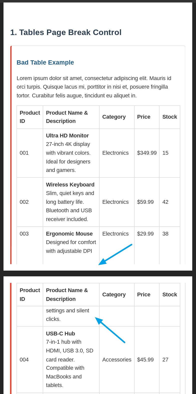
Tables, charts, and forms need extra attention when converting HTML to PDF.
Table Handling
Large data tables require special treatment for proper PDF output.
Table styles for PDF conversion:
table {
  width: 100%;
  border-collapse: collapse;
  page-break-inside: auto; /* Allow tables to break across pages */
}

/* Allows headers to repeat on each new page */
thead {
  display: table-header-group;
}

tr {
  page-break-inside: avoid; /* Keep rows together where possible */
  page-break-after: auto; /* But allow breaks between rows */
}

/* Make table footers appear at the end of the table */
tfoot {
  display: table-footer-group;
}
Strategies for Large Data Tables
When dealing with extensive data tables:
- Logical separation: Split large datasets into multiple related tables.
- Header consistency: Maintain identical column structure across split tables.
- Print-specific styling: Use condensed fonts and reduced padding for print media.
- Row grouping: Use
<tbody>elements to group related rows logically.
Table Best Practices
| Do ✅ | Don't ❌ |
|---|---|
Use proper HTML table elements: <thead>, <tbody>, <tfoot>. | Build tables with divs/spans. |
| Use absolute units (pt, in, cm). | Use relative units (%, em). |
| Keep row heights reasonable. | Create overly tall rows. |
| Test with real production data. | Test with minimal sample data. |
| Simplify complex tables for print. | Include interactive elements. |
Charts and Data Visualization
For charts and visualizations in PDFs:
- Use vector formats (SVG) whenever possible.
- Ensure proper sizing and aspect ratios.
- Consider simplified versions for print.
- If using canvas-based charts, ensure they're properly rendered before conversion.
- Add explicit text labels (avoid tooltip-dependent data).
- Test printed output in grayscale to verify contrast.
- Consider pre-rendering complex visualizations to static images.
Chart optimized for PDF output:
<!-- SVG chart elements with explicit sizing -->
<div class="chart-container" style="width: 6in; height: 4in;">
  <svg id="bar-chart" viewBox="0 0 600 400" aria-labelledby="chart-title">
    <title id="chart-title">Q3 Sales Performance by Region</title>
  </svg>
</div>
Styles for chart PDF rendering:
.chart-container {
  page-break-inside: avoid; /* Keep charts on one page */
  margin: 0.25in 0; /* Provide breathing room */
}
Form Fields
Most HTML forms convert to static representations in PDFs:
<form class="pdf-form">
  <!-- Include clear visual styling for form elements -->
  <div class="form-field">
    <label for="full-name">Full Name:</label>
    <input type="text" id="full-name" name="full-name"
           style="border: 1pt solid #999; padding: 4pt; min-height: 14pt;">
  </div>

  <div class="form-field">
    <label for="email">Email Address:</label>
    <input type="email" id="email" name="email">
  </div>
</form>
For truly interactive PDF forms, specialized libraries like PDFLib are typically required. Most HTML to PDF converters only create static representations of form elements.
Images and Media Optimization
Images often cause issues when you convert HTML to PDF – pixelated logos, broken layouts, and oversized file sizes. These practices help:
Image Resolution and Format
- Vector images (SVG): Best for logos, icons, and illustrations.
- Raster images: Use appropriate resolution (typically 150-300 DPI for print).
- Format selection: JPG for photos, PNG for transparency, SVG for vectors.
<!-- ✅ Vector logo for crisp printing at any size -->
<img src="company-logo.svg" alt="Company Logo" class="logo">

<!-- ✅ Photo with print-appropriate resolution -->
<img src="team-photo.jpg" alt="Team Photo" width="1200" height="800">
Image Sizing and Positioning
Explicitly set dimensions to prevent layout shifts:
.document-image {
  width: 3in; /* Use absolute units for print consistency */
  height: auto; /* Maintain aspect ratio */
  display: block; /* Prevents inline alignment issues */
  margin: 0.2in auto; /* Centers image with consistent spacing */
}
Handling Background Images
Background images require special attention in print contexts:
.hero-section {
  background-image: url('hero-bg.jpg');
  background-size: cover;
  -webkit-print-color-adjust: exact; /* Safari/Chrome */
  color-adjust: exact; /* Firefox */
  print-color-adjust: exact; /* Standard */
  padding: 0.5in; /* Use print units for padding */
}
PDF Image Format Reference
| Image Type | Best Format | Resolution | Notes |
|---|---|---|---|
| Photos | JPG | 300 DPI | Balance quality vs file size. |
| Logos/Icons | SVG | Vector | Scale without quality loss. |
| Screenshots | PNG | 144-192 DPI | Preserve text clarity. |
| Diagrams | SVG/PNG | Vector/144+ DPI | Maintain clean lines. |
| Backgrounds | JPG | 150-200 DPI | Lower resolution often sufficient. |
Using web-optimized images in PDFs intended for printing, resulting in pixelated output. Always use print-quality assets for PDF conversion.
If your PDFs go to a commercial printer, see our guide on print-ready PDF/X-1a and PDF/X-4 generation for CMYK and ICC profile requirements.
This guide focuses on HTML before conversion. For an existing file, use the free PDF compressor to reduce file size or the free PDF/X converter when a printer asks for PDF/X output.
Quick PDF Troubleshooting Guide
| Problem | Solution |
|---|---|
| Text overflow | Apply overflow-wrap: break-word; hyphens: auto; to box with fixed widths. |
| Missing styles | Add <style> in <head> with essential print styles using specific selectors.For critical elements, use inline styles with style attribute. |
| Layout shifts | Set exact dimensions with print units: width: 6in; height: 4in;Avoid relative positioning and floats in critical content. |
| Hidden content | In print media query, target collapsible elements: .hidden-content { display: block; visibility: visible; opacity: 1; } |
| Print media detection | Use @media print { } for print-specific styles and @page { size: A4; margin: 2cm; } for page dimensions. |
Test PDF output with multiple browsers and conversion tools, as rendering engines may interpret CSS differently.
Applying These Optimization Techniques in Practice
The CSS and HTML patterns work with any HTML to PDF conversion tool that supports @media print and @page rules. Here is how they apply when using an API-based converter.
HTML Conversion with Optimization
When using PDFBolt's API, you can implement all the optimization strategies from this guide:
- Print-specific CSS: Include
@media printrules in your stylesheets. - Page control: Use
@pagerules for margins and sizing. - Page breaks: Implement
page-break-inside: avoidand related properties.
PDFBolt uses emulateMediaType: print by default, so your print-specific CSS rules are applied during conversion.
// Example API call with optimized HTML
{
  "html": "<html><!-- Your optimized HTML --></html>",
  "format": "A4",
  "margin": {
    "top": "2cm",
    "bottom": "2cm",
    "left": "2cm",
    "right": "2cm"
  }
}
Template-Based Approach
For organizations managing multiple document types, PDFBolt's template system offers additional advantages:
- Centralized optimization: Apply best practices once in the template designer.
- Consistent output: All documents generated from a template inherit the same optimized structure.
- Easy updates: Modify styles, page breaks, or layouts in one place.
- Team collaboration: Any team members can update content while maintaining optimized PDF output.
This works well when you need consistent formatting across many documents – update the template once, and all future PDFs inherit the changes.
Convert HTML to PDF with a simple API call. PDFBolt HTML to PDF API handles rendering with headless Chrome and returns PDFs via a REST endpoint.
Conclusion
The key to reliable HTML to PDF conversion: use @media print for styling, @page for page dimensions, page-break-inside: avoid on elements that should stay together, and absolute units (pt, cm, in) instead of relative ones. Embed fonts with @font-face, use SVG for logos and diagrams, and test the output with your actual data.
Comprehensive PDF Conversion Checklist
Document Structure
- ✅ Use semantic HTML elements (
<article>,<section>,<header>, etc.). - ✅ Implement proper heading hierarchy (h1 → h2 → h3).
- ✅ Group related content within appropriate container elements.
- ✅ Validate HTML to ensure proper structure.
CSS Optimization
- ✅ Implement dedicated print-specific CSS using
@media print. - ✅ Set explicit page size with
@page { size: A4; }. - ✅ Define appropriate margins for all page edges.
- ✅ Use absolute units (pt, in, cm, mm) for print-specific measurements.
- ✅ Apply appropriate line heights (1.2-1.5 for print content).
- ✅ Set orphans and widows controls for text flow.
Typography and Fonts
- ✅ Embed custom fonts properly using complete
@font-facedeclarations. - ✅ Provide appropriate fallback fonts in every font stack.
- ✅ Use appropriate font sizes for print (10-12pt for body text).
- ✅ Apply proper font weights for different heading levels.
- ✅ Ensure good contrast between text and background.
Page Break Management
- ✅ Control page breaks around headings with
page-break-after: avoid. - ✅ Prevent breaking inside crucial elements with
page-break-inside: avoid. - ✅ Force breaks after major sections when appropriate.
- ✅ Configure table headers to repeat across pages (
display: table-header-group).
Images and Media
- ✅ Use appropriate resolution images (minimum 150-300 DPI for print).
- ✅ Apply vector formats (SVG) for logos, icons.
- ✅ Set explicit image dimensions to prevent layout shifts.
- ✅ Optimize file sizes while maintaining quality.
- ✅ Ensure proper color profiles (consider CMYK for professional printing).
- ✅ Include
alttext for all images for accessibility.
Headers and Footers
- ✅ Implement page numbering using appropriate techniques for your converter.
- ✅ Create consistent headers/footers using proper positioning techniques.
- ✅ Add document title, dates, and other identifying information.
Testing and Validation
- ✅ Review PDF output across multiple PDF viewers.
- ✅ Test with actual production data, not just sample content.
- ✅ Verify rendering on both screen and printed output.
- ✅ Test with different page sizes if the document needs to be flexible.
HTML to PDF: It's like fitting an octopus into a shoebox... but now you know how! 🐙